Making DeFi risk readable.
- DeFi
- Risk UX
- Design System
- Design Lead
DeFi lending lets you deposit crypto as collateral and borrow against it without a bank in the middle — but the mechanics (collateral ratios, liquidation thresholds, leveraged farming) are unforgiving, and most DeFi UIs render the most important number on the page (your distance to liquidation) as a percentage buried in a sidebar. I led brand, product, and the design system for Apricot Finance: the Apricot Bar replaced that percentage with a color-progression risk indicator, the atomic system shipped 1:1 with engineering's React components, and the consumer surfaces (X-Farm in particular) compressed multi-contract leveraged-farming complexity into a single panel.
- Role
- Design Lead
- Timeline
- Jan 2022 — Jan 2023
- Team
- 5-person design team I recruited
- Tools
- Figma, Design Systems, User Research
Most of my work lives behind NDAs and embargoes. The walkthrough that matters — the why, the things I cut, the calls I'd make differently — happens in conversation, not on a page.
DeFi lending protocols let you deposit one crypto asset as collateral and borrow another against it — without a bank, an underwriter, or a credit check. The catch is that if your collateral's market price drops past a liquidation threshold, the protocol auto-sells it to make the lender whole, and you take the loss.
That risk is the most important number on the page, but most DeFi UIs render it as a percentage buried in a sidebar. Apricot shipped a leveraged variant where users could borrow to amplify a position — meaning even smaller market moves could trigger liquidation.
How do you make liquidation risk and leverage feel understandable enough that users act confidently — while building brand, an atomic design system, and a 5-person team from zero against a startup deadline?
Built the brand, the system, and the team
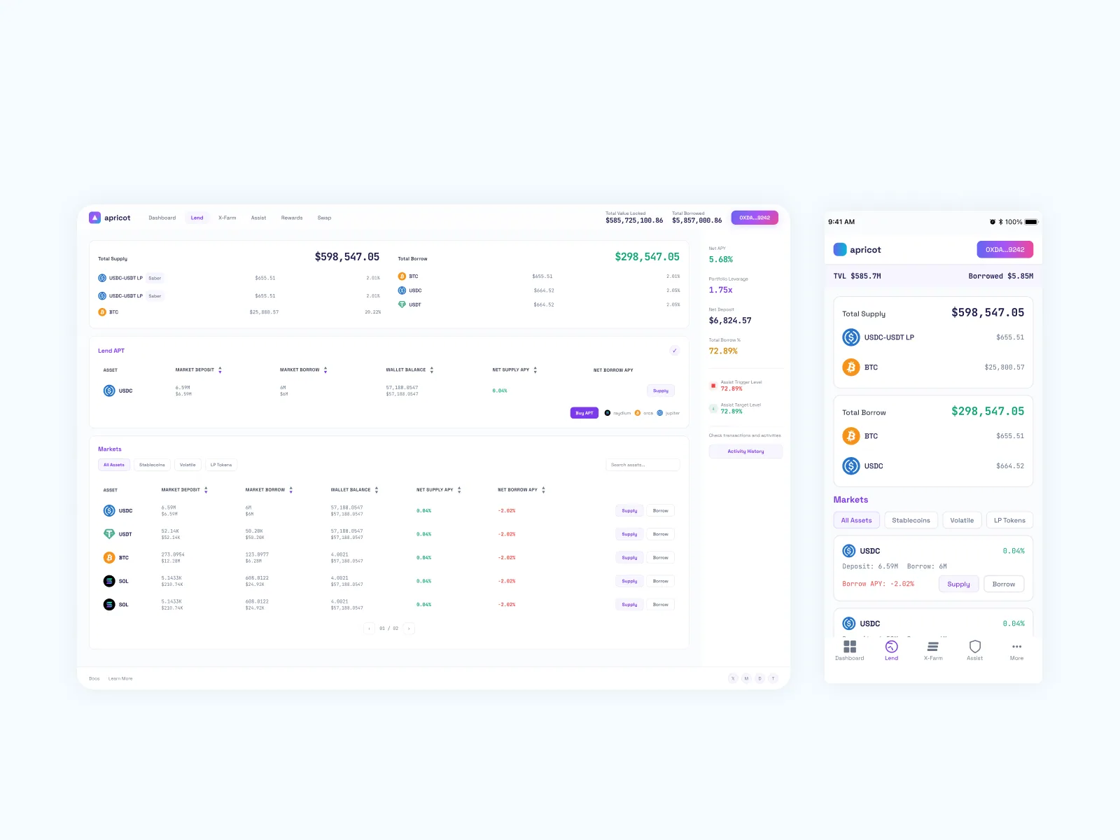
Atomic design system shipped to production via React component migration; new visual layer was deployed to a separate environment (since taken down with the project's shutdown). Original onboarding, X-Farm leveraged-farming flow, Lend Dashboard, Assist Configuration, Rewards, and Swap shipped during tenure.
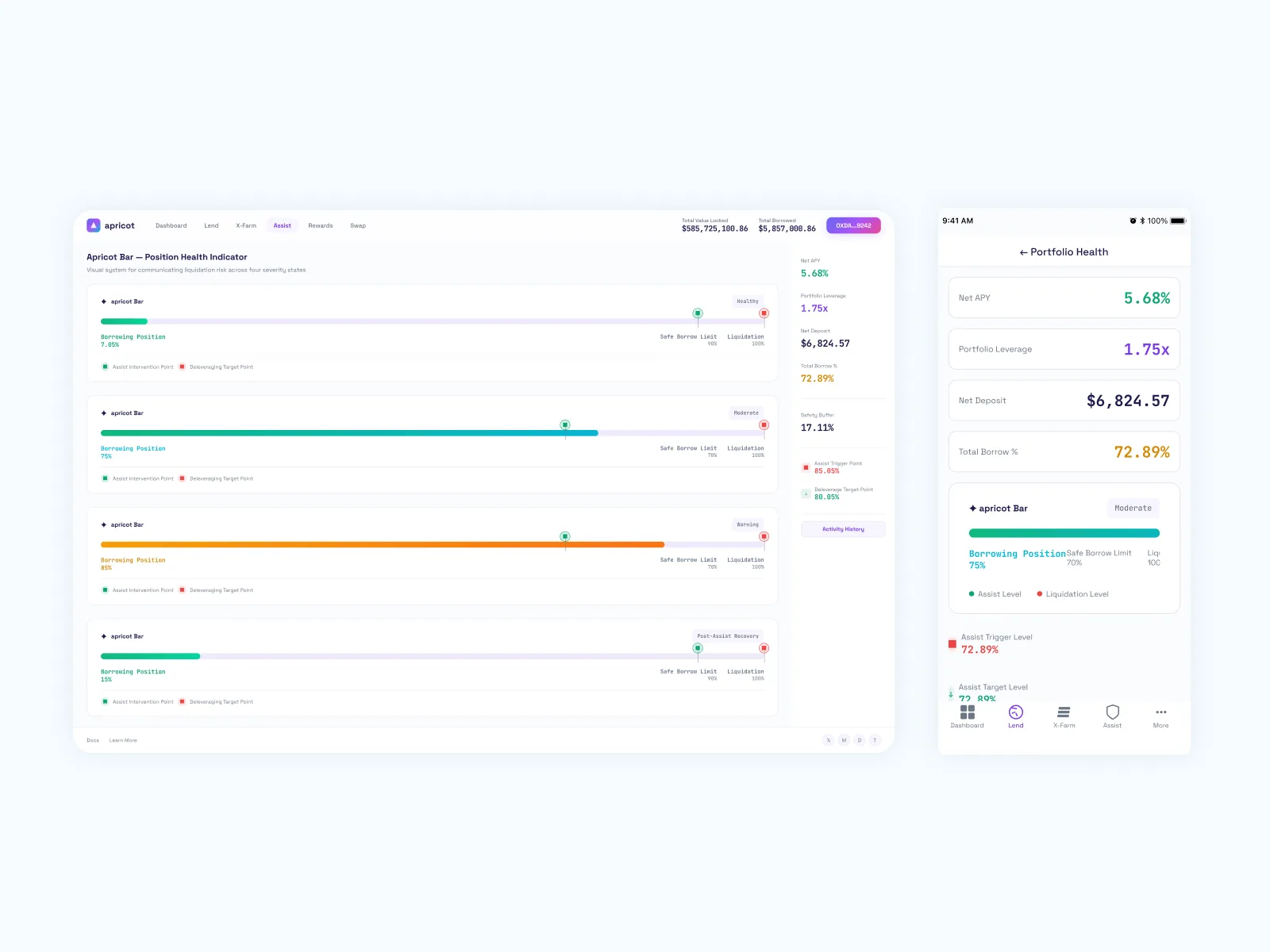
Liquidation risk, rendered as a color you can read.
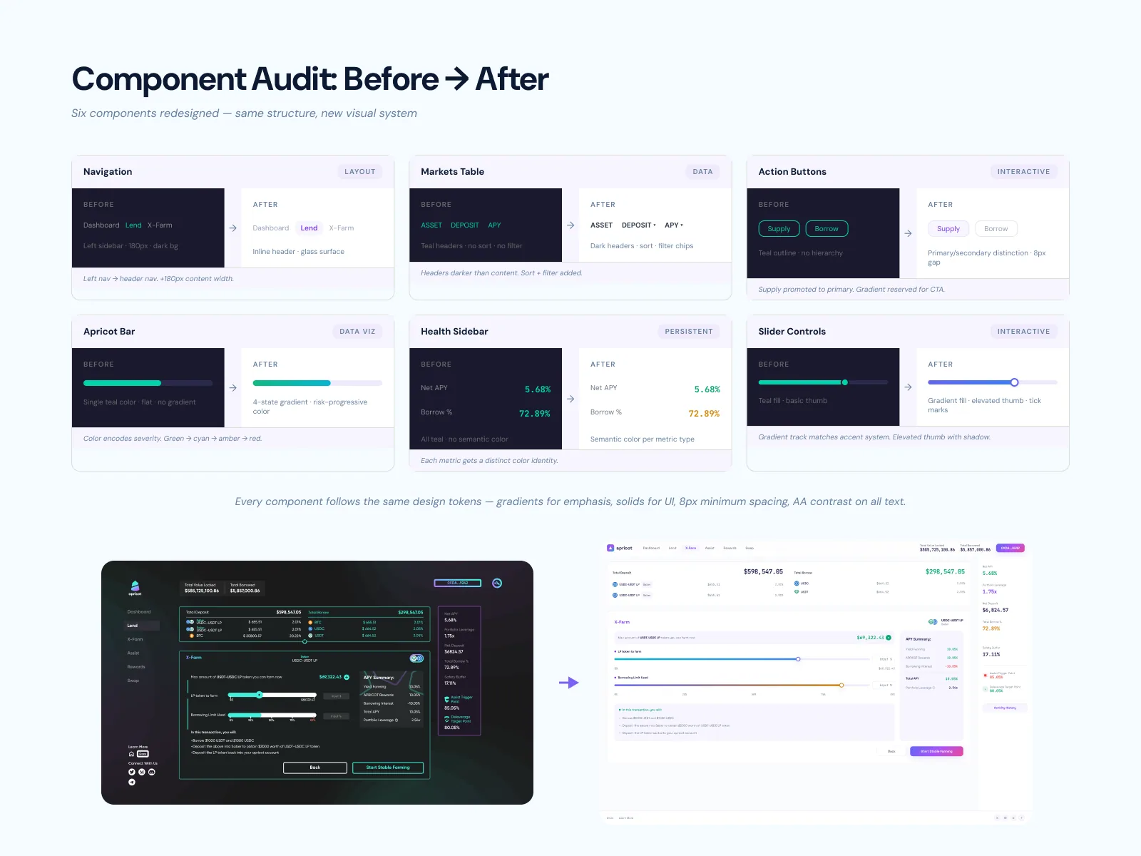
DeFi lending UIs typically render liquidation risk as a percentage in a sidebar. The problem: percentages need math. Users don't see "I'm at 75%" as "three-quarters of the way to a forced sale" — they see a number that has to be compared to other numbers to mean anything. The Apricot Bar replaces that with a 4-state color-progression bar: Healthy / Moderate / Warning / Recovery. The user sees position-relative-to-danger before parsing any percentage.
Reference markers for assist intervention and deleveraging targets sit on the track itself, not in a legend — so users see exactly where the protocol will step in to defend their position. The bar became the protocol's signature data-viz, used across Lend Dashboard, X-Farm, and the Assist Configuration interface. I came back in 2026 and proposed inline placement variants and severity-driven dynamic CTAs as A/B test material — designing the artifact, then auditing its placement years later as system extensions, not ad-hoc fixes.
1:1 token parity with the engineers who shipped it.
The atomic design system I built — design tokens (color, type, spacing, radius) → atoms → molecules → organisms — was named to mirror the engineering team's CSS variables and React component names exactly. I sat with engineers and mapped Figma layer naming ↔ React props, Figma variants ↔ component states, design tokens ↔ CSS variables. The typical Figma-vs-code drift never opened.
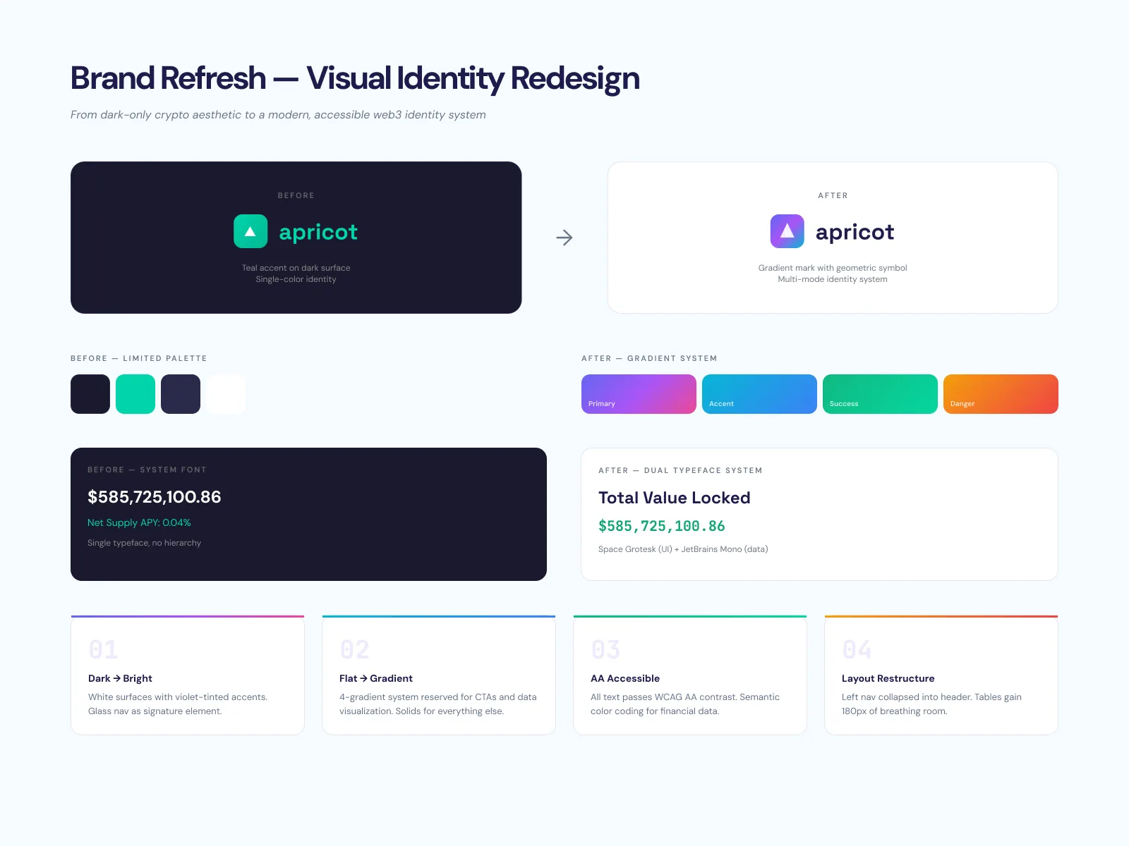
Brand identity moved from a dark-mode-edgy DeFi default to a "web3-native bright" positioning, with a gradient identity reserved for CTAs only (so gradients stay legible as positive-feedback affordance) and a dual-typeface system — Space Grotesk for UI text, JetBrains Mono for data — that signals "crypto-native financial tool." Tokens were documented as named CSS variables shipped alongside the Figma library, and components were annotated for handoff so engineers built against the same names they'd see in code — design system as documentation, not just a Figma file.
“I sat with the engineers and mapped Figma to React, line by line. The drift never opened.”
Designed down, not up.
DeFi UIs default to power-user-first: every parameter on screen, every advanced setting one click away. The Apricot consumer surfaces went the other direction. Slippage default 0.5% — safe for newcomers, tunable for power users. Risk Profile abstracts the complex parameters (APY range, leverage cap, Assist trigger) into three plain-language tiers — Steady / Balanced / Aggressive — with a "Recommended" badge that orients attention to the default.
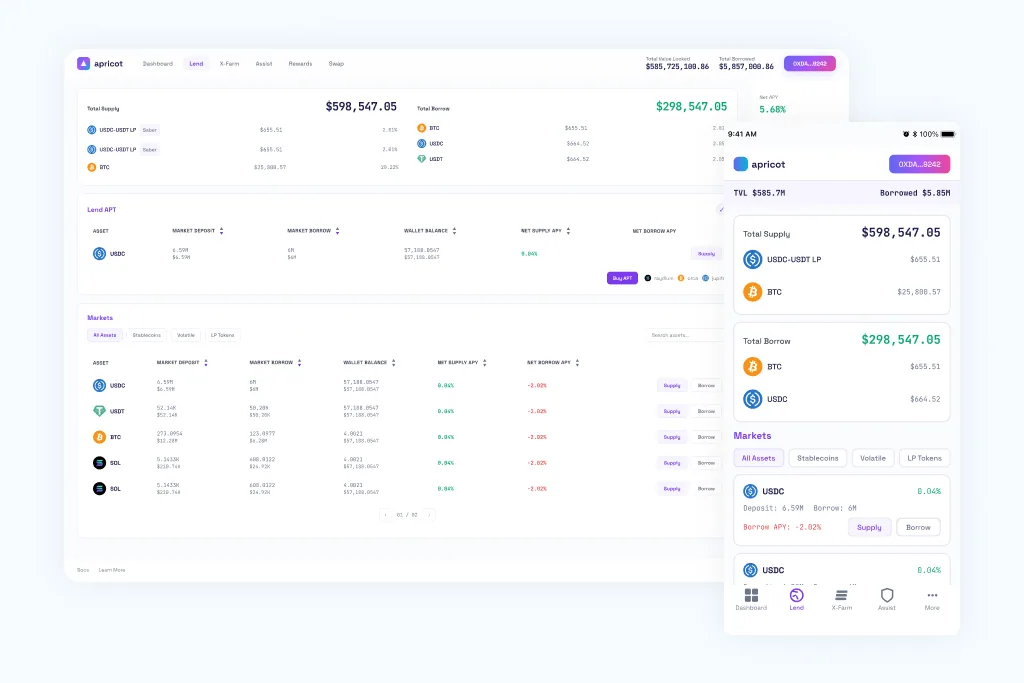
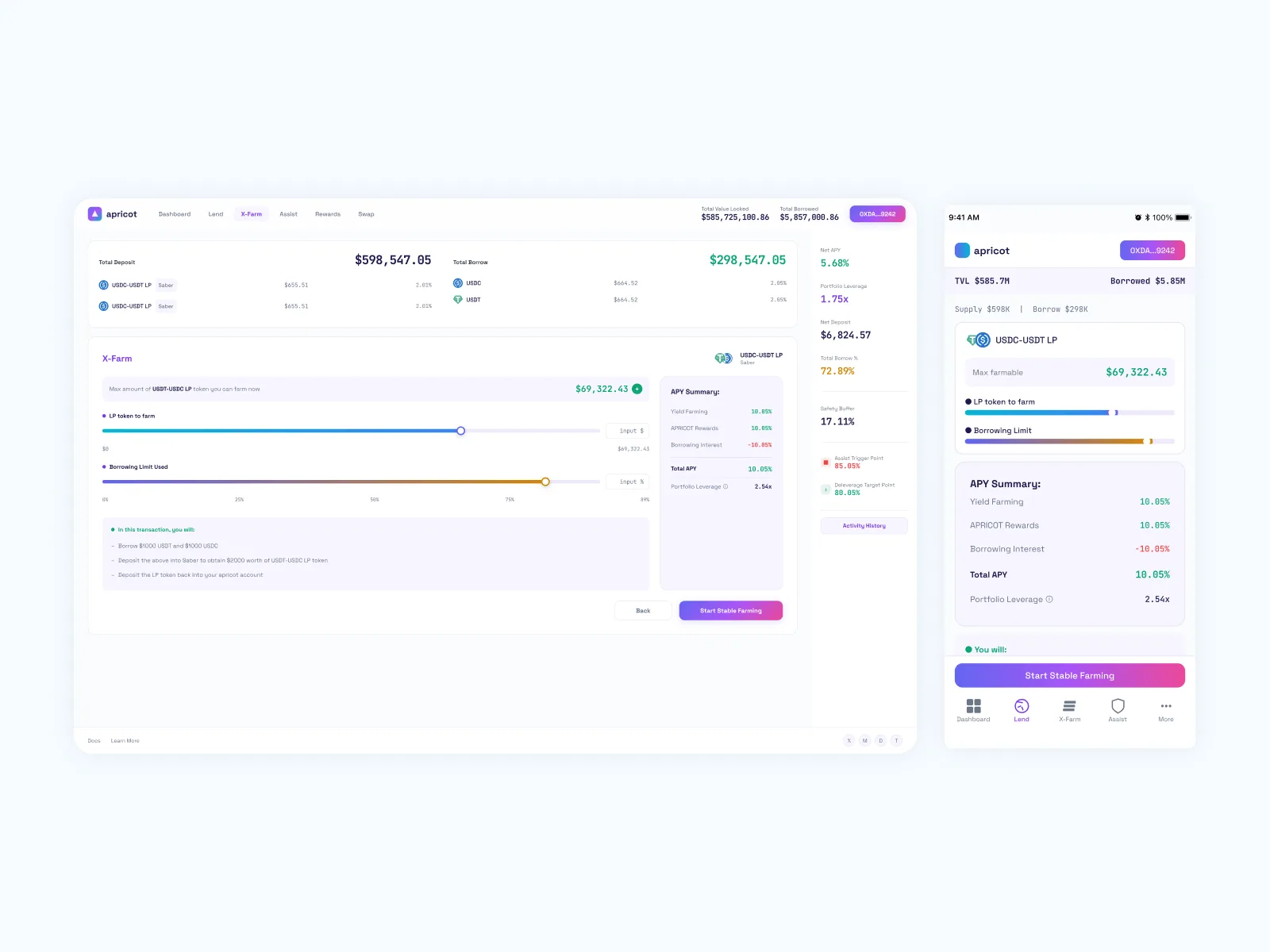
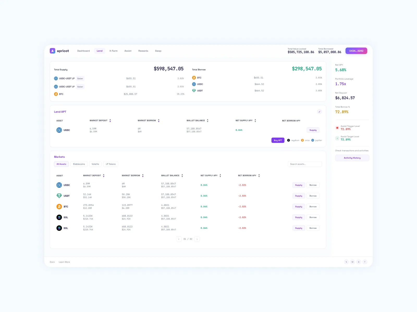
Trust scaffolding sits at every transactional step: read-only-until-approved transaction model surfaced as a trust badge, plain-language transaction summary as the last safety checkpoint pre-confirmation, "No funds were moved" copy on every error state. The flagship X-Farm flow collapsed multi-step multi-contract leveraged farming into a single panel — one slider for LP amount, one for borrowing limit, with APY broken out as line items (farming yield + protocol rewards + borrowing interest) so users could see what they were earning and what they were paying. X-Farm and Lend Dashboard ship parity across desktop and mobile, with the same flows on each surface. The FTUX itself was its own design problem: a 6-screen onboarding with explicit drop-off-risk scoring per screen, a wallet-not-gated default that lets users explore the full product before connecting (radical against DeFi convention), suggested deposit amounts to clear blank-field paralysis, and a confirmation screen designed as a persuasive conversion artifact — earnings projection, what's-next checklist, share prompt — instead of a flat success state. Empty and error states get the same care: bottom-sheet for transaction errors, "No deposit yet" amber row in the confirmation summary, illustration-led empty state on the dashboard.
Where I made the calls.
- 01Designed the Apricot Bar — the protocol's signature liquidation-risk indicator — as a 4-state color-progression bar (Healthy / Moderate / Warning / Recovery) with anchored reference markers (assist intervention, deleveraging targets) on the track itself, not in a legend. Color replaces numeric parsing as the primary signal, so users see position-relative-to-danger before parsing percentages.
- 02Built the atomic design system from zero: design tokens (color, type, spacing, radius) → atoms → molecules → organisms, with token naming mirrored 1:1 against the engineering team's CSS variables and Figma component names aligned to React component names. Sat with engineers and mapped Figma layer naming ↔ React props, Figma variants ↔ component states, design tokens ↔ CSS variables — closed the typical Figma-vs-code drift before it could open.
- 03Overhauled brand identity — moved the protocol from a dark-mode-edgy DeFi default to a "web3-native bright" positioning, with a gradient identity reserved for CTAs only (so gradients stay legible as positive-feedback affordance) and a dual-typeface system (Space Grotesk for UI text, JetBrains Mono for data) that signals "crypto-native financial tool."
- 04Designed the consumer surfaces — Lend Dashboard, X-Farm, Assist Configuration, Swap, Rewards — with progressive disclosure as page architecture (chart toggles restructure entire layout), trust scaffolding (read-only-until-approved trust badge, plain-language transaction summaries, "No funds were moved" error copy), and abstracted Risk Profile tiers (Steady / Balanced / Aggressive) so newcomers had a usable default.
- 05Audited the system years later and caught real defects: green at #0EA572 failed AA contrast on white (corrected to #0C8C5E), mobile touch targets under 44px on slider thumbs and stepper controls, missing atoms (input fields, checkboxes, toggles, tooltips) that had been built ad-hoc. Documented as a self-audit, not a victory lap.
- 06Recruited and ran a 5-person founding design team (3 junior designers screened on consumer UX + design methodology). Ran biweekly design reviews + workshops, set up an async-comment-then-sync-critique format that respected junior designers' processing time, and pre-briefed the team the day before workshops — pattern that consistently raised the quality of group critique.
Audited my own system three years later.
Coming back to a system you built to find what it got wrong is harder than building it. The 2026 self-audit caught a green that failed AA contrast (#0EA572 → #0C8C5E), mobile touch targets under 44px on slider thumbs and stepper controls, and missing atoms — input fields, checkboxes, toggles — that had quietly been built ad-hoc.
The reason I'd port that audit pattern forward isn't the audit itself — it's that it kept the design-system muscle exercised on a system I no longer ship. Designing systems and auditing them years later are the same skill, just one is harder to schedule than the other.